1 Membership System, 10 markets
From regional variations to one membership system
Overview
A phone-number field started as a Taiwan retail requirement. But once other regional teams requested the same capability, I discovered a larger problem: RHINOSHIELD’s 10 regional websites had evolved with different personal-information fields, rules, and interfaces.
Rather than introducing another regional variation, I worked with Marketing and Dev team to establish a shared structure for personal information—keeping regional differences configurable while making the overall experience more consistent, maintainable, and easier to extend.
The new foundation later supported phone verification, more flexible gender options, profile-completion incentives, and birthday rewards across the global e-commerce experience.
Role
UX / Product Designer
Timeline
Apr. - Jun. 2021 (8 weeks)
Team
UX Designer / Dev Team of 2 / Marketing Team of 3 / Retail Team
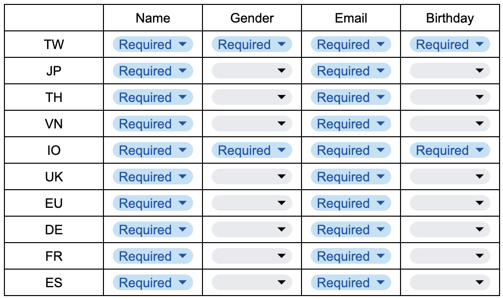
"Personal Information" form when I joined
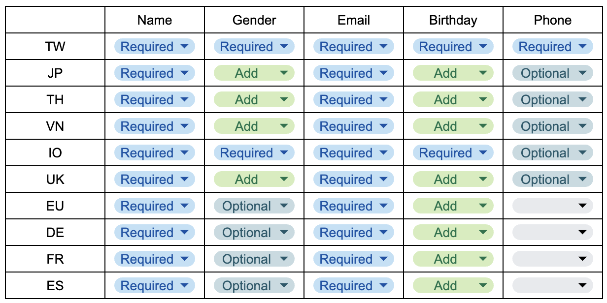
"Personal Information" form by the request
01—The Original Request
It started with one phone-number field
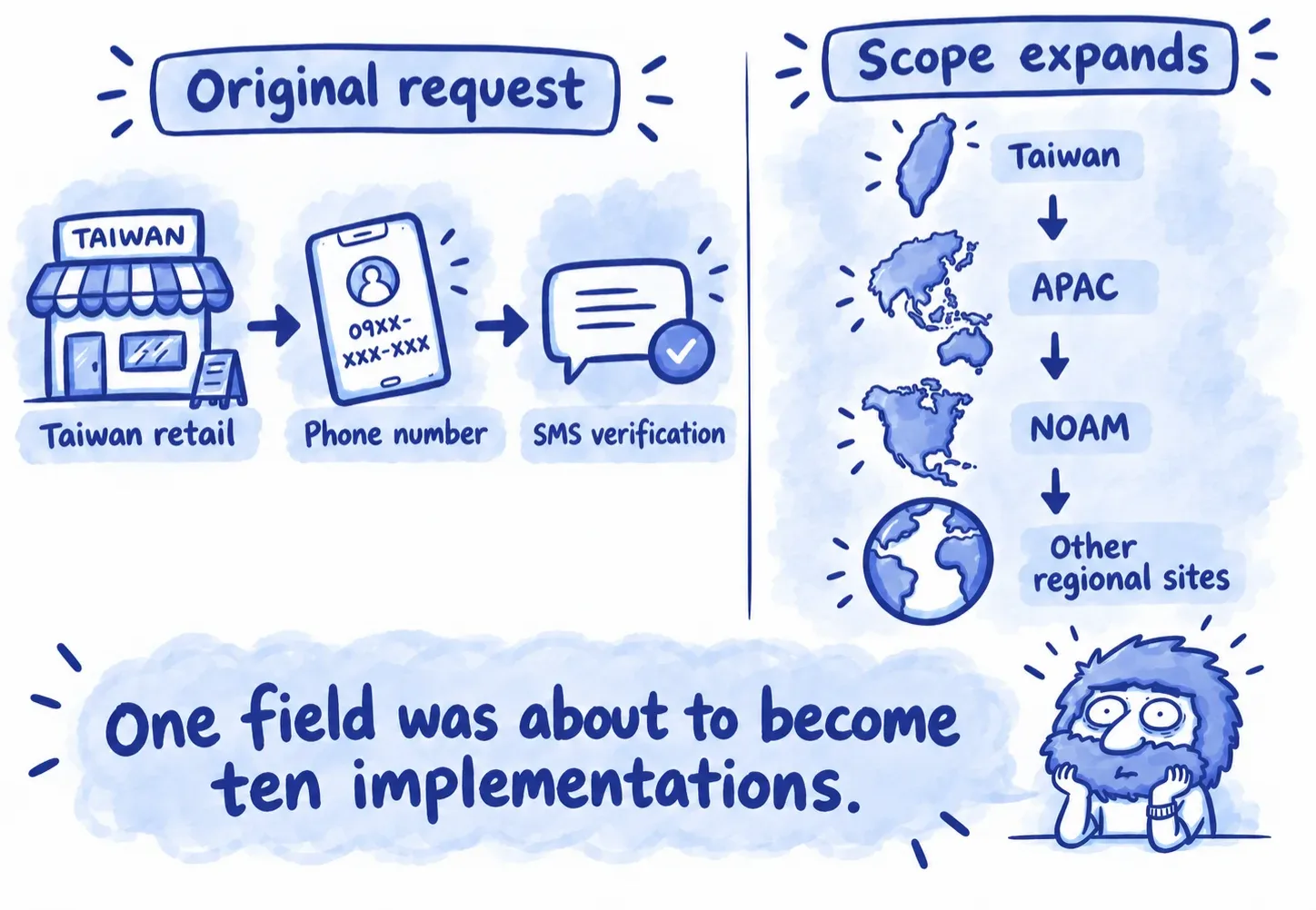
In 2021, RHINOSHIELD was expanding its physical retail presence in Taiwan. At an in-store checkout counter, asking customers for a phone number was more practical than asking for an email address. However, the existing membership system did not support phone numbers at all.
The original project scope was therefore straightforward:
Add a phone number field and verification flow to the Taiwan membership experience
On its own, this was a relatively small feature request. But the scope changed quickly. Once the feature was confirmed as feasible, other regional teams also wanted phone-number support for SMS communication and promotional campaigns.
Then, a Taiwan-specific change was becoming a global membership requirement.
02—The REAL problem
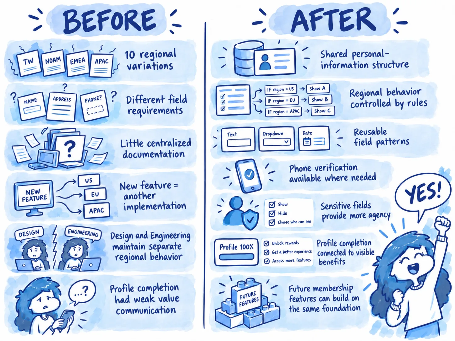
One membership system had evolved into ten different rule sets
When I reviewed the existing personal-information experience, I found that the 10 regional websites were already behaving differently. Some regions required gender and birthday information, while other did not. Name and email were consistently required but the rest of the profile depended on regional business rules. Therefore, the interfaces had also evolved independently over time. Adding phone number separately to each version would not solve the underlying problem—it would create another layer of inconsistency.
The challenged was not adding another field. It was deciding how new fields should behave across a fragmented system.
03—The organizational constraints
The inconsistency was not only visible in the UI
At the time, the dev team had no dedicated project manager, and much of the website behavior had not been formally documented. There was no shared PRD or centralized reference describing:
which fields existed in each market
which fields were required
how validation behaved
how regional differences should be handled
or how future changes should be implemented consistently
And because I was also supporting other projects, creating and maintaining 10 separate design variations was not sustainable. So, instead of extending the existing fragmentation, I proposed that we use this project as an opportunity to create a more manageable structure.
Changes depended heavily on whoever happened to know how that regional website worked.
04—Reframing the project
From "add a phone number field" to "create a shared personal-information system"
The immediate business request was still important. But solving only that request would have preserved the same maintenance problem. So I decided to reframe the design challenge:
How might we introduce membership requirement while minimizing unnecessary differences between our 10 regional experiences?
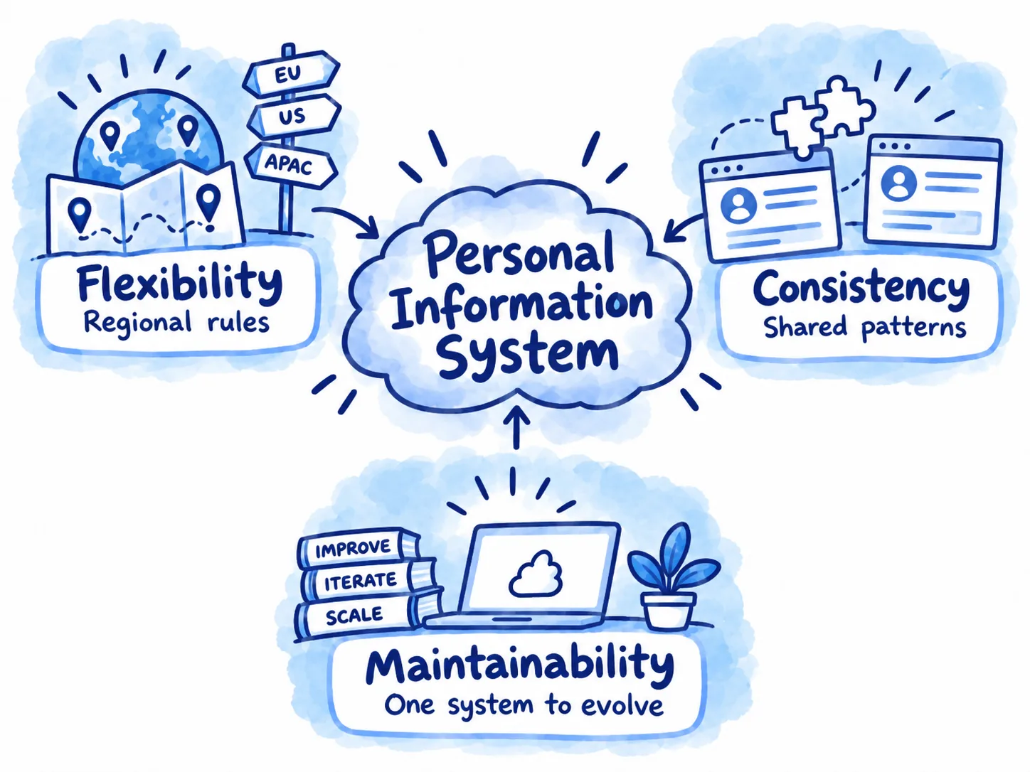
The system needed to support 3 things at once:
Regional flexibility: markets still had legitimate differences in business and date requirements
Experience consistency: common fields and interaction patterns should behave the same wherever possible
Future maintainability: a future change should not require redesign and documenting the same experience ten times.
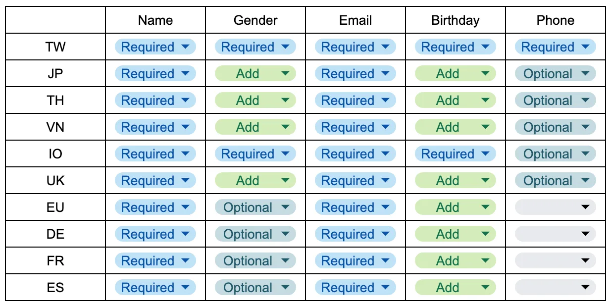
Same interface pattern, but different configuration
05—The system model
Instead of treating each regional website as a separate team, I proposed treating personal information as a shared set of components with configurable regional rules.
The same field could exist globally while behaving differently depending on the market. With this, the interface structure remains consistent but the rules can change.
Regional variation became configuration rather than a separate design.
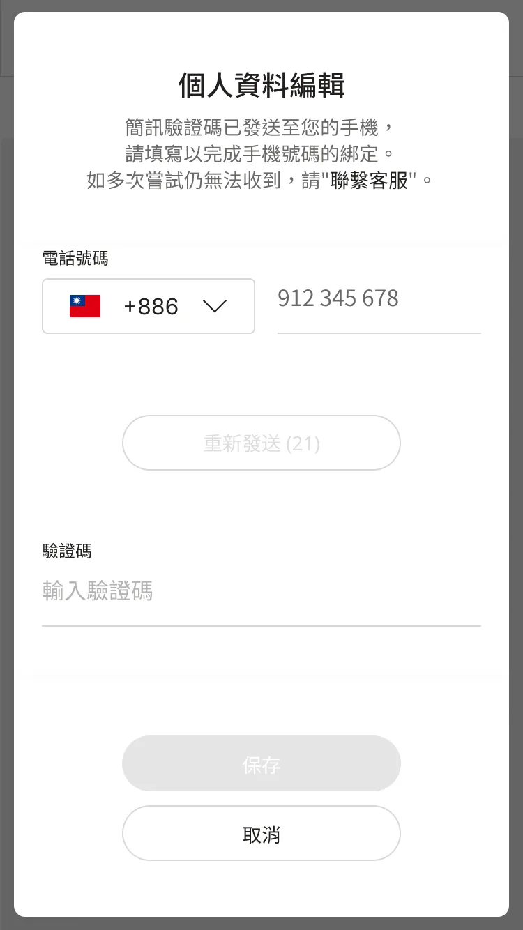
Verifying phone number in Taiwan
06—Adding phone number & verification
The original request became the first test of the new system
Phone number was the first major field introduced using the shared structure. For Taiwan, it could support retail identification and SMS verification. Other regions could enable the same field according to their own marketing needs without requiring a separately designed interface.
This meant we were no longer solving:
How should Taiwan's phone number field work?
We were solving:
How should a phone-number field behave as apart o the global membership system?
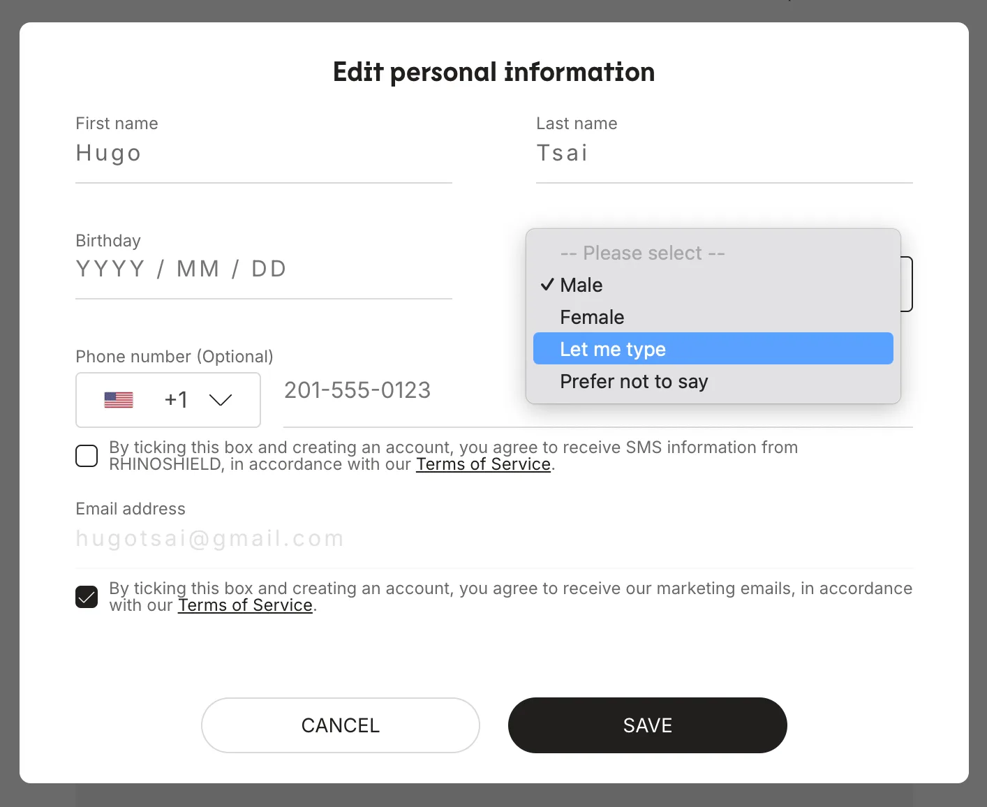
Consistency did not mean removing user choice
07—Designing sensitive information with more agency
Standardizing the system also gave us an opportunity to revisit sensitive profile information. And gender was one exmaple.
Instead of limiting customers to a strict binary choice, we introduced options such as:
Male
Female
Let me type
Prefer not to say
The goal was not simply to create more options, but to preserve the business requirement while giving customers more control over how—or whether—they provided sensitive information.
Standardize the structure, not the person using it.
08—Extending the foundation
Once the structure was stable, we could build more than a form
The standardized personal-information system made it easier to build features that depended on profile completeness and eligibility.
Instead of creating another isolated feature, the reward experience could use the same profile data and shared rules.
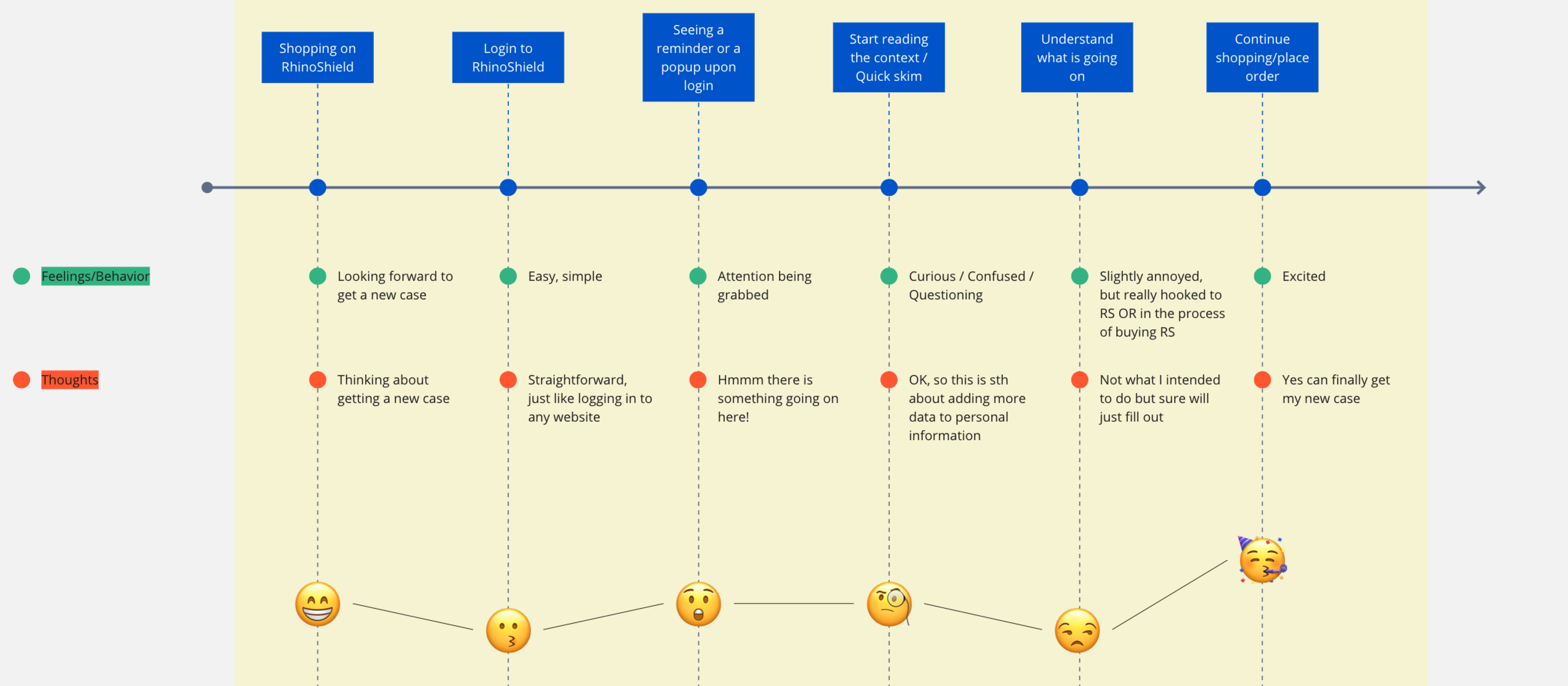
Customer journey of the existing users
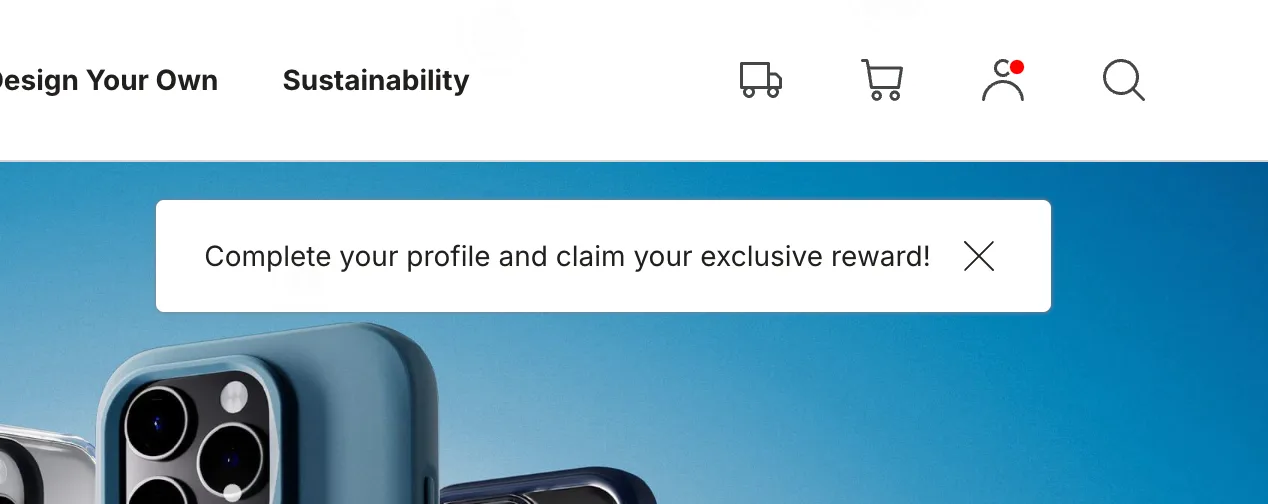
Contextual incentive
09—Making the value exchange clear
The core concept to this is that "if we ask for more information, users should understand why"
Customer are more willing to complete them when the value of doing so is clear. Therefore we introduced contextual reminders connecting profile completion to the birthday reward.
Instead of asking:
Complete your personal information
the messaged could communicate:
Complete your profile and claim your exclusive reward
This turned profile completion form an administrative task into clear value exchange.
10—Making eligibility visible
The personal information page was updated to make reward qualification visible. This addressed a common uncertainty:
Have I completed everything I need?
Rather than asking users to remember what information they had already provided, the account experience communicated their current status and how close they were to qualifying.
Users should know whether they are done
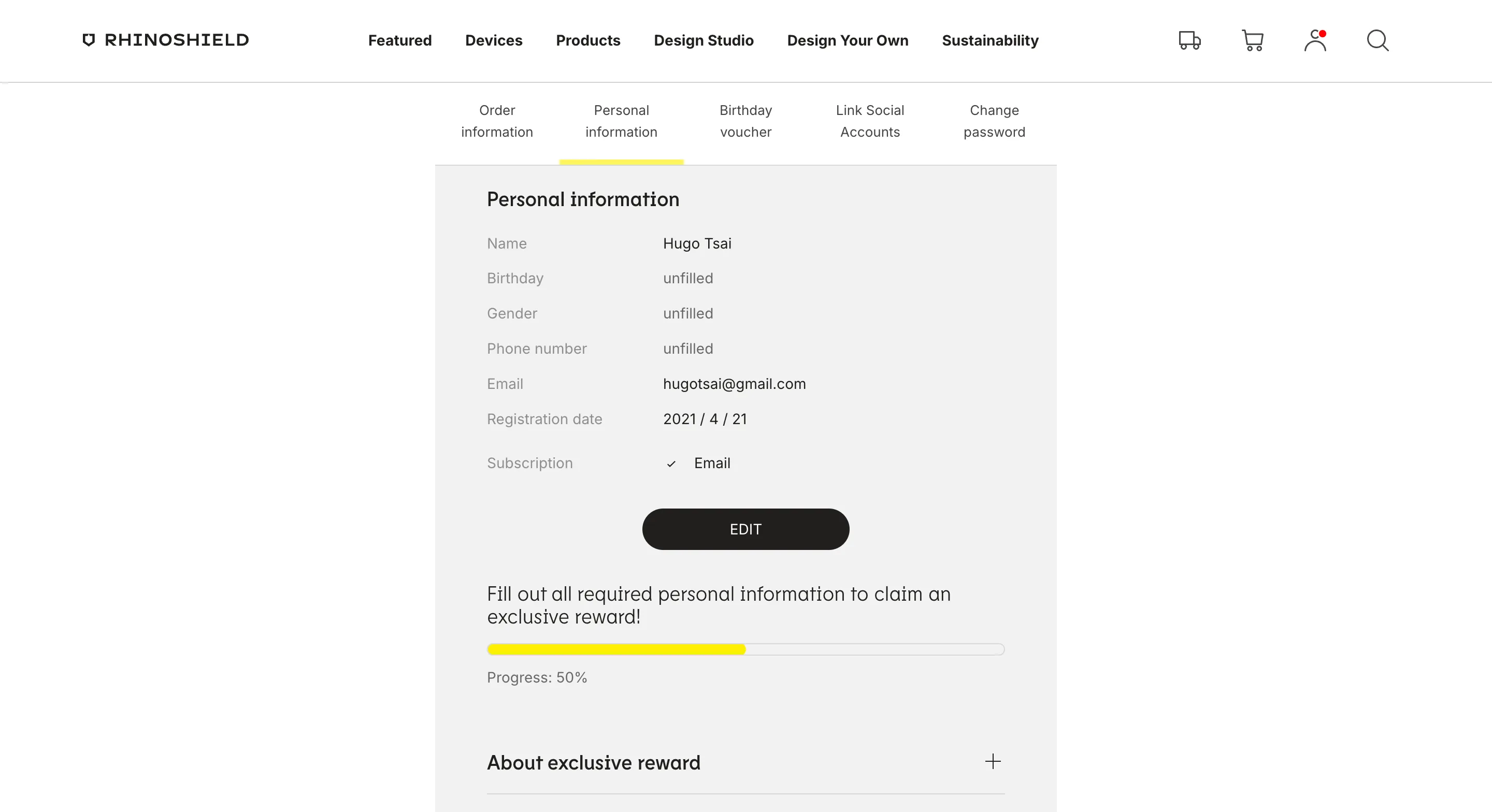
Make progress visible when the user is working toward a benefit
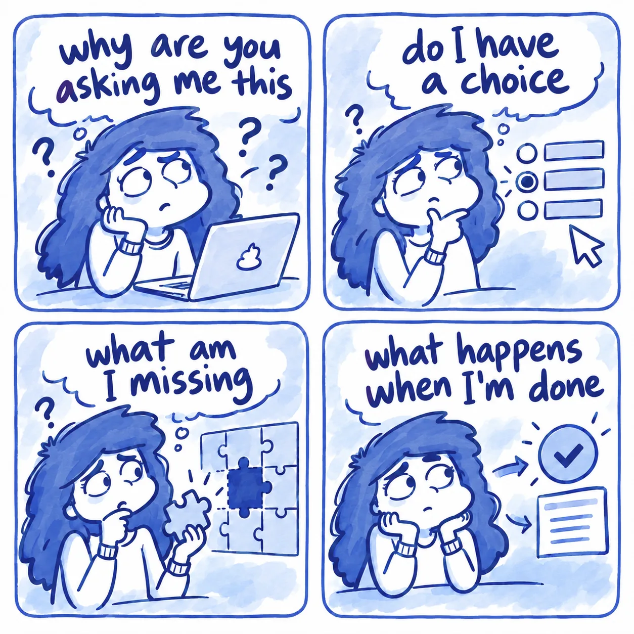
11—Designing the workflow around real user questions
Why are you asking me this?
Explain the value and purpose
Do I have a choice?
Provide appropriate flexibility for sensitive information
What am I missing?
Make incomplete states visible
What happens when I'm done?
Show qualification and reward outcomes
12—Beyond the product
The project also exposed a gap in how the team worked
While working on the membership system, I also found that design and development collaboration lacked some basic infrastructure. There was no centralized documentation for many existing behaviors, which made implementation, QA, and future maintenance harder than necessary.
I helped introduce improvement such as:
clearer documentation mapping input fields to design
a shared drive for image-resources and content translation
a centralized ticket board for bugs and development issues accessible to relevant stakeholders
The goal was to reduce repeated questions and make knowledge less dependent on individuals.
13—Outcome
A more consistent system did not come at the cost of conversion
Within the first month after launch:
82%↑
Completion rate
23%↓
Registration dropout
The redesigned system allowed additional profile information to be collected while reducing the number of users abandoning registration. Customers across the regional websites could also access the reward experience through a more consistent account flow.
The redesigned interface supported additional profile data without increasing friction, while the completion reward gave users a clear reason to complete their profiles. The reward, a 10% off discount code, was ultimately used across 71,000 orders, demonstrating strong engagement with the reward program.
13—Final reflection
When I joined the project, the request sounded simple: add a phone-number field to the Taiwan membership experience. But looking across all 10 regional websites made it clear that adding one more field independently would only make an already fragmented system harder to maintain.
The project taught me to look beyond the immediate interface request and ask what will happen after the next feature, the next region and the next person inherits the system. Instead of designing multiple variations, we created a shared structure that could absorb future differences through configuration. And these became the lesson I carried away from the project:
Good systems do not eliminate every difference
They make those differences intentional and manageable.
Caribou
Order tracking